Forest School for a Rainy Day
Educational Design
Project Brief
Forest for a Rainy Day School was developed in partnership with the Forest School Association to create a nature-inspired indoor space for outdoor learning when poor UK weather limits access. Housed in a Grade II listed building in Devonport, Plymouth - a community with limited access to natural environments, the project addresses green deprivation by offering inclusive, accessible experiences for children and families. The space is divided into three zones: The Garden, The Nest, and the Parent Café, each designed for different age groups and users. Sustainability is embedded through the use of natural, recycled, and tactile materials that reduce environmental impact while supporting sensory development. This project encourages positive learning experiences, fosters community connection, and highlights how sustainable, inclusive design can transform underused spaces into vibrant hubs for education and wellbeing.

Scope of Work - Concept Creation, Sketchup, VRAY, Branding, AutoCAD, InDesign, Procreate
Project Drivers

UK Weather
Unreliable weather in the UK affects how often children can engage in outdoor learning.
Green Deprivation
Many households do not have access to green spaces such as gardens or do not have access to a car to drive to local nature reserves.

Inclusive Spaces
Many education and play spaces lack areas and sensory elements for SEN children and disabled children.

“Nature is a tool to get children to experience not just the wider world, but themselves.”
The Site
The site is a grade 2 listed building situated in Devonport, Plymouth in the old Market Hall, the original building was constructed in 1852 and a restoration project was started in 2013. Which turned the space into a co-working space with an extension that holds a cafe and a 360 dome. Devonport is a deprived area so has the need for more spaces aimed at the future generation.


The Users & Client
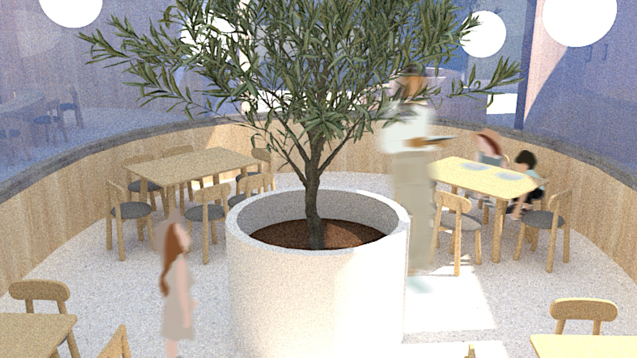
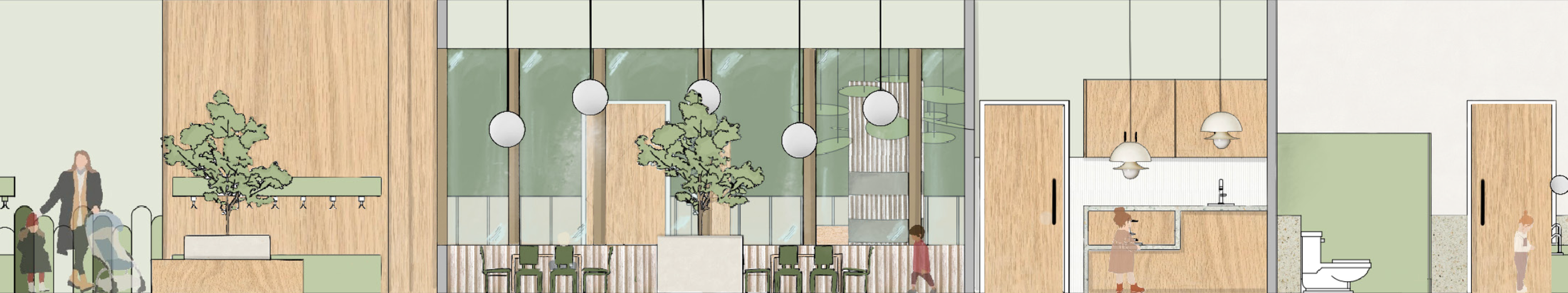
The space focusses 3 users - Children who have three separate areas, The Garden which is aimed at 5-12 year olds, The Nest nursery which is split into 2 spaces for children aged 2-3 and 4-5 and also a baby area situated in the parent cafe. As the space is situated in a deprived area, parents have their own calming space to converse with others. Staff also have their own area to relax.


The project is developed in partnership with the Forest School Association, embracing its child-led approach to outdoor learning. Rather than limiting nature play to fair weather, the space supports year-round exploration, building confidence and resilience.
This ethos shaped a layout that guides children through age-specific zones — encouraging discovery, supported risk-taking, and a lasting connection to nature.

The Concept
This concept was rooted in nature, aiming to create a space that feels organic, calming, and exploratory. Natural textures, playful elements, and a sense of freedom guided early decisions, laying the groundwork for the overall environment seen in The Garden and beyond.
Branding for Forest for a Rainy Day was designed to feel friendly, approachable, and rooted in nature — much like the Forest School experience itself. Inspired by the visual language of children’s learning materials and outdoor adventure badges, the brand uses soft greens, rounded typography, and playful illustrations to appeal to both children and parents. The name, colour palette, and layout all reinforce the centre’s mission: to make outdoor learning accessible, joyful, and welcoming, whatever the weather. The guide-book and logo form part of a wider identity that supports communication, recognition, and connection with the community.
Project Branding

Inspiration

Visual Identity
I wanted the branding to reflect the overall theme of the project, so I chose a childlike yet legible font to create a friendly and approachable identity. I developed the concept by exploring visual references and found inspiration in Girlguiding badges, which influenced the playful, nature-driven style of the final design.
The logo evolved through a combination of sketching, digital experimentation, and visual research using Pinterest boards. I focused on typography that felt youthful yet clear, with rounded forms to echo the softness and inclusivity of the space. The circular layout, inspired by badges was aimed to feel familiar, fun, and symbolic of achievement. The final result is a logo that’s both playful and practical, adaptable across all brand touchpoints.

Brand Communication
To expand on the branding element of the design, I created a Parent Guide to support clear communication between the space and its users. Designed to be friendly and accessible, the guide introduces the concept behind the project, explains the different age-specific zones, and includes key information such as opening times and the Forest School ethos.
It also features my visualisations to help parents better understand the look and function of the space. Styled in line with the overall brand identity, the guide strengthens consistency while also helping new visitors feel informed, welcomed, and reassured. Beyond practical use, it supports a sense of community connection, encouraging parents to feel part of the space, not just visitors within it.


Project Presentation Boards